The Big Idea
Good for people. Good for business.
the challenge
Create a brand that stands up against the ‘Big 4’ management consultancies in Australia’s top boardrooms.
I can’t speak highly enough about this team and their fabulous work. Orkest’s new website and branding is a result of their professionalism, hard work and patience.
Jim Seawright
Founder – Orkest
Outcomes
Finding the balance between people and business
An in-depth industry literature review confirmed what we all knew. Workplaces aren’t what they used to be — our work and our well-being are inextricably linked.
Brimble had created brand equity in the market as a rail maintenance specialist, but never talked about their technology. We needed to create new associations with the brand to position it as a sector leader by talking way more about the impact of their tech.
We discovered that Australia was currently lagging behind on global rail innovation, way behind our international counterparts. Just 0.01% of rail patents were from Australia. This opened up a narrative window that the team could genuinely back-up: link Brimble as a key component to the progress of Australian rail innovation.
Modern approach = modern name
The former brand name lent heavily on the business owner’s identity, and we needed to evolve the brand name beyond it. We took a more abstract approach to the name, gunning for differentiation and memorability.
The ideas we needed to convey through the name had to marry up with the bigger ideas of the brand: harmony and balance. The name also couldn’t be too roster-specific either as it would be limiting to future brand extension ideas.
Of the three we presented, Orkest was the winner – inspired by the concept of an orchestra working together in harmony. Being short and unique, it was enough for a trademarking fast-track. In a sea of corporate sounds, Orkest is the kind of name that sticks with you.
Balancing concepts of quantitative data with the human factor.
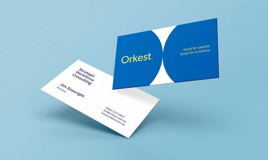
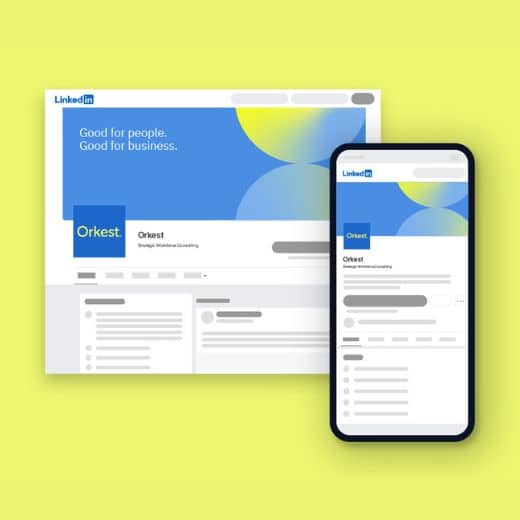
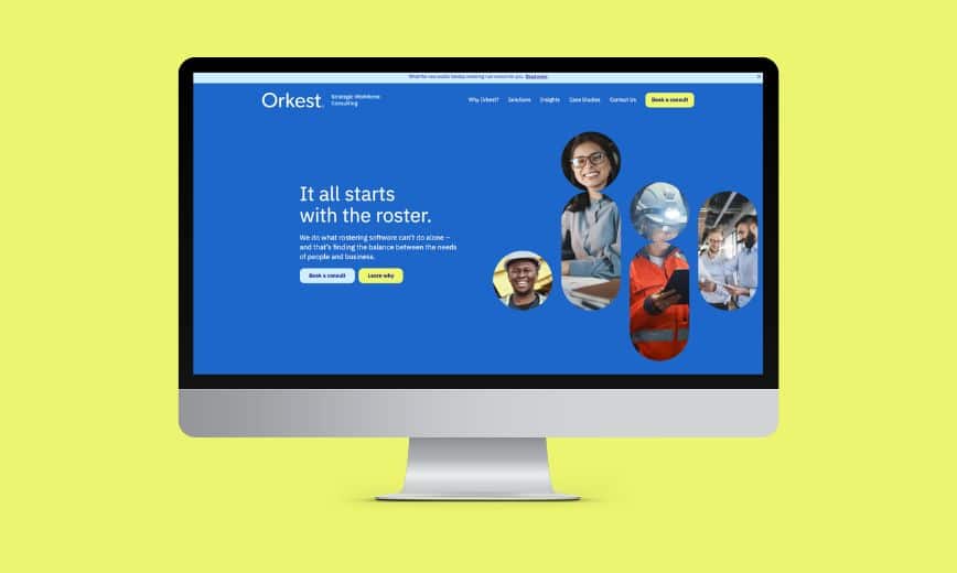
The core element of the new visual identity is the circle, representing Orkest’s understanding of the whole picture of an organisation’s needs. Instances where the circles touch symbolise the coming together of people and ideas.
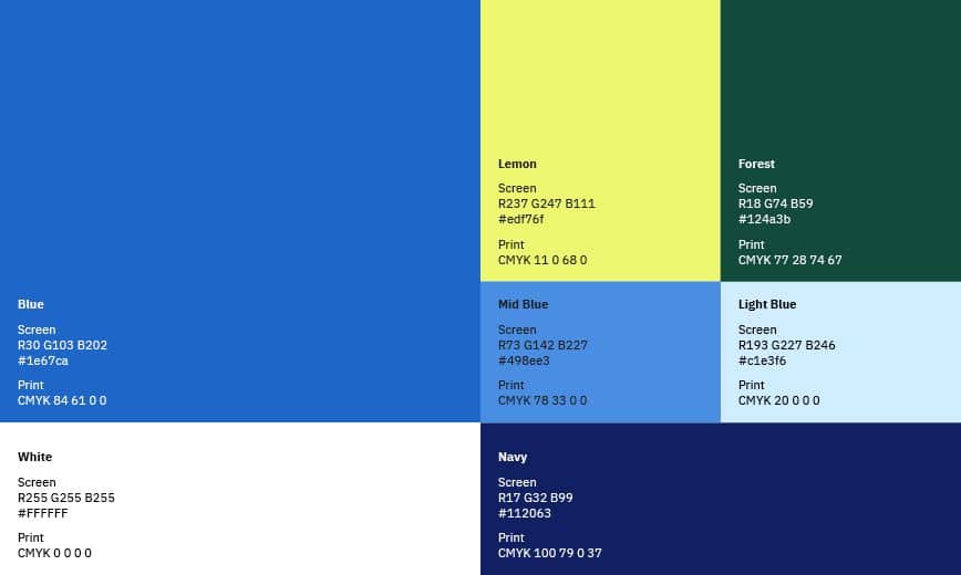
Elongated circles represent the balancing act of rostering along with the graphs and data Orkest works with. Further extension shows a human figure emerge, symbolising the importance of real people when it comes to a sound rostering strategy – not just data points plugged into software. The colour palette is thoughtful, trusted & motivating and the gradient indicates depth & movement – choices that put this brand in line with its competitors while still having a unique perspective and space to own.
Driving home Orkest’s capabilities and point of difference
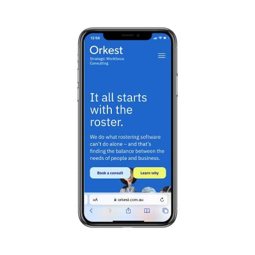
The website is a true extension of the visual identity – an interactive, modern application that speaks to the brand’s essence while relaying its services and capabilities in a coherent and user-friendly way.
The Approach page, ‘Why Orkest’ and the case studies were key engagement zones to drive home Orkest’s point of difference and proven track record in creating superior workforce solutions.
As a relationship-driven business that focuses on human understanding and interactions vs automation and spreadsheets, the key user task is to ‘Book a consult’ to reinforce that connection.
Things we learned along the way
The category wasn’t speaking about real people
When we looked at how category players communicate, the majority spoke about people as mere commodities – resources to be used, numbers to be crunched. We saw an opportunity to change this. Create a brand that spoke to people as people, a brand that advocated for their needs as much as the organisation’s. This early takeaway provided the initial inspiration to carve out the unique angle for Orkest and their role as the bridge between the two competing priorities.
.
Automation can only go so far. brand requires.
As workplaces focus on automating as many tasks as possible, the brand used its more traditional approach (think more conversations and focus groups vs automated spreadsheets and tracking software) to show that the best results come from a combination of deep human thinking and technology. The industry was too reliant on new software that promised it all but didn’t deliver the human-focussed solutions needed in today’s workplace. Orkest was the right answer.
