The Big Idea
Technology will lead the way.
the challenge
Create a space for Brimble to own in an industry dominated by large multinationals.
success snapshot
87% increase in branded searches
- Brand Strategy + Custom Website
Renewed team unity and camaraderie
- Brand Strategy
Fresh attention from big industry players
- Visual Identity
15% engagement rate on LinkedIn
- Social Media
517% increase in reactions since website launch
- Social Media
Amazing company and people to work with. Very clever and talented team.
Rebecca Brimble
Systems Integration & Marketing Manager
Brimble
Outcomes
Communicating the impact of their technology
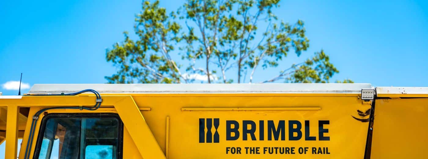
Brimble’s stated difference was their technology. Completely unique, custom technology created in-house, making rail resurfacing safer, more connected and more efficient for the people conducting this essential work.
Brimble had created brand equity in the market as a rail maintenance specialist, but never talked about their technology. We needed to create new associations with the brand to position it as a sector leader by talking way more about the impact of their tech.
We discovered that Australia was currently lagging behind on global rail innovation, way behind our international counterparts. Just 0.01% of rail patents were from Australia. This opened up a narrative window that the team could genuinely back-up: link Brimble as a key component to the progress of Australian rail innovation.
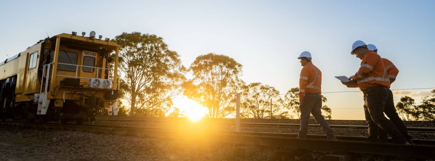
Make them the formidable player they are.
With three generations in rail, the brand needed to communicate its strong legacy and focus on homegrown innovation.
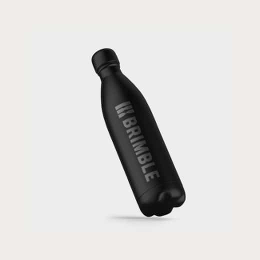
The brand refresh sought to modernise the visual identity, elevating it to compete against larger players.
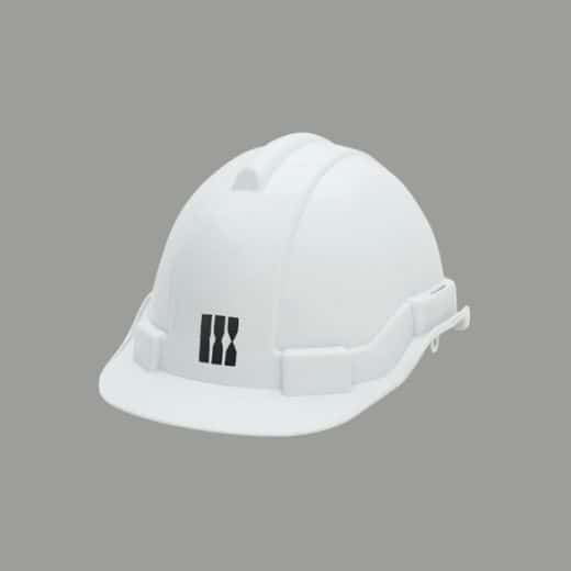
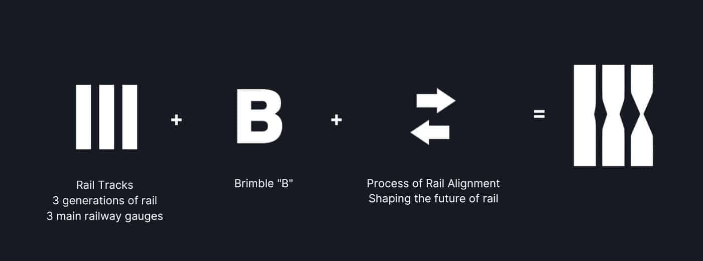
Inspired by the track resurfacing process, we looked at materials & textures, blending the idea of tangible process with strength, trust and innovation. The icon takes the idea of rail tracks, 3 generations of rail for Brimble and the 3 main railway gauges in Australia that they service.
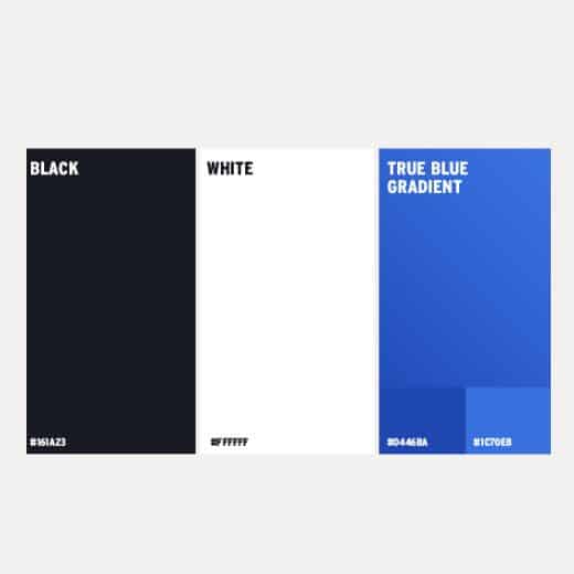
This along with the “B” and an arrow concept representing the process of rail alignment create a solid, bold & trustworthy mark that truly represents and elevates Brimble. A strong black & white core palette, with the introduction of a vibrant ‘Aussie true blue’ – adds approachability and differentiation.
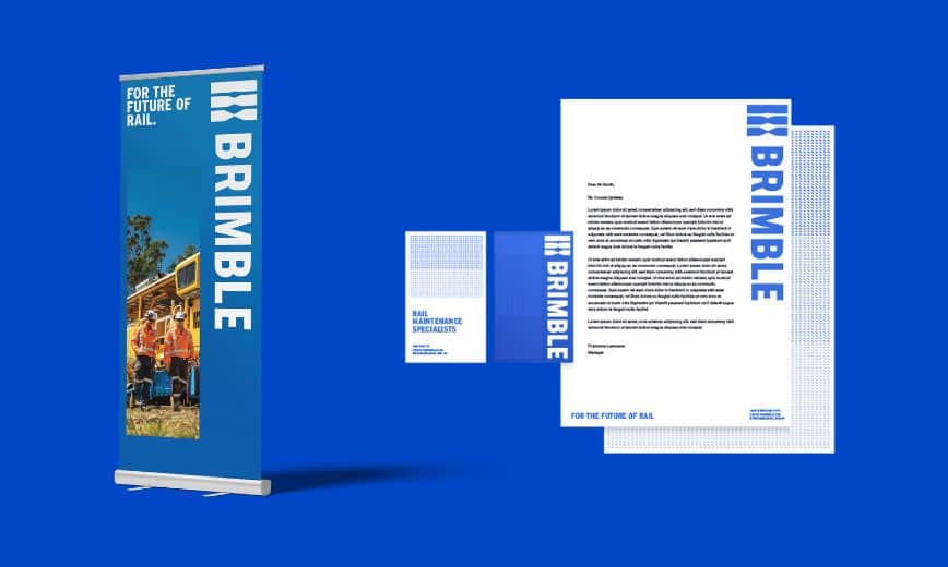
Showcase the machinery that sets them apart
Brimble needed a website that could highlight its advanced technology and communicate its offering as the best choice for rail maintenance projects.
We created a custom WordPress website with a bespoke machine catalogue, so users could find and understand various machines and their capabilities.
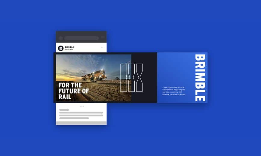
Our team built a highly visual site that was just as punchy as it was informative and easy to use. To elevate and modernise the brand away from traditional competitors, we created elements such as a vertical menu. As a strong proof point, a custom projects page was developed to showcase metrics in an engaging and digestible format.
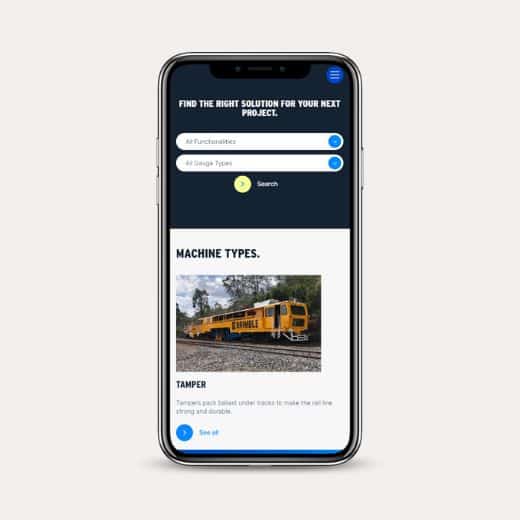
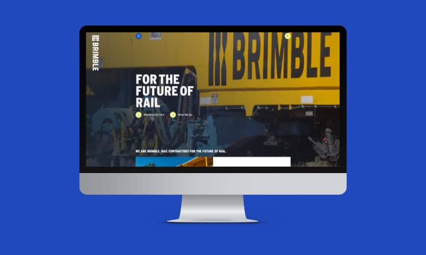
Things we learned along the way
Speaking to team = beacons of inspiration.
Time and time again, we find immense inspiration comes from talking to employees about work. Engaging internal stakeholders early in the brand development process, and having them contribute to ideation are essential ingredients to build a brand that feels right and can be adopted internally. You need to unpick the organisational DNA that exists in order to build something meaningful for the future.
.
Refreshing a family brand requires empathy.
Business owners and especially family-owned businesses can have a real attachment to their existing logo. As an agency, we needed to have a lot of empathy around how they felt about the brand refresh and letting go of their existing brand. We took extra time to show them the strategy & thinking behind the visual brand to help them adjust to the change. Once they did, they never looked back.
